Visualizing Data
The Data Management Web App provides multiple tools for visualizing observational data that have been loaded.
Dynamic Sparkline Plots
The landing page for a monitoring site shows a list of datastreams measured or observed at that site. Each datastream has a sparkline plot that displays the most recent available data, including the timestamp and value of the last observation. Sparklines for datastreams with fresh data are shown in green and sparklines with older data are shown in grey.
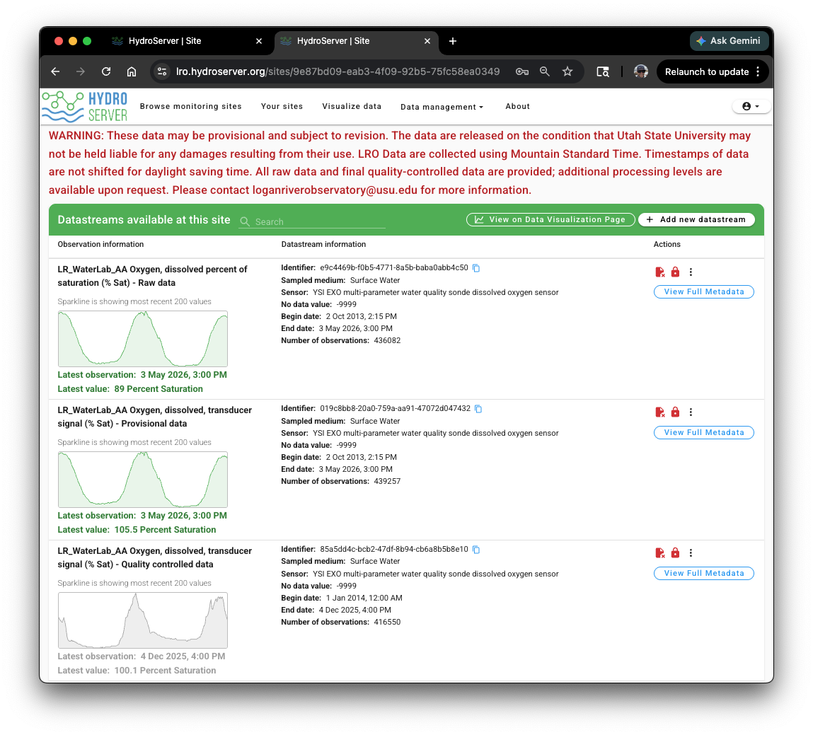
NOTE: You can control the visibility of datastreams on the site landing page for users using access control and visibility settings for your monitoring site and datastreams. See the HydroServer Access Control topic.
Time Series Viewer
Clicking on a sparkline in the datastream list opens a time series viewer with a quick and dynamic view of the selected time series. The time series viewer provides dynamic plot zooming controls at the top right and simple date range selection at the bottom left to control the extent of data shown in the plot
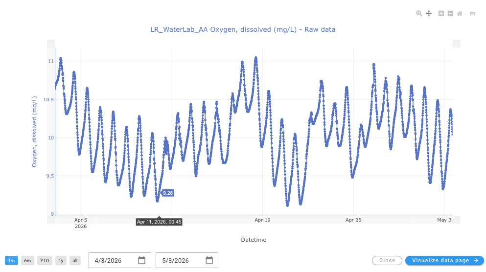
At the bottom right of the time series viewer, you can click the 'Visualize data page' button to launch that time series into the HydroServer data visualization page for further exploration.
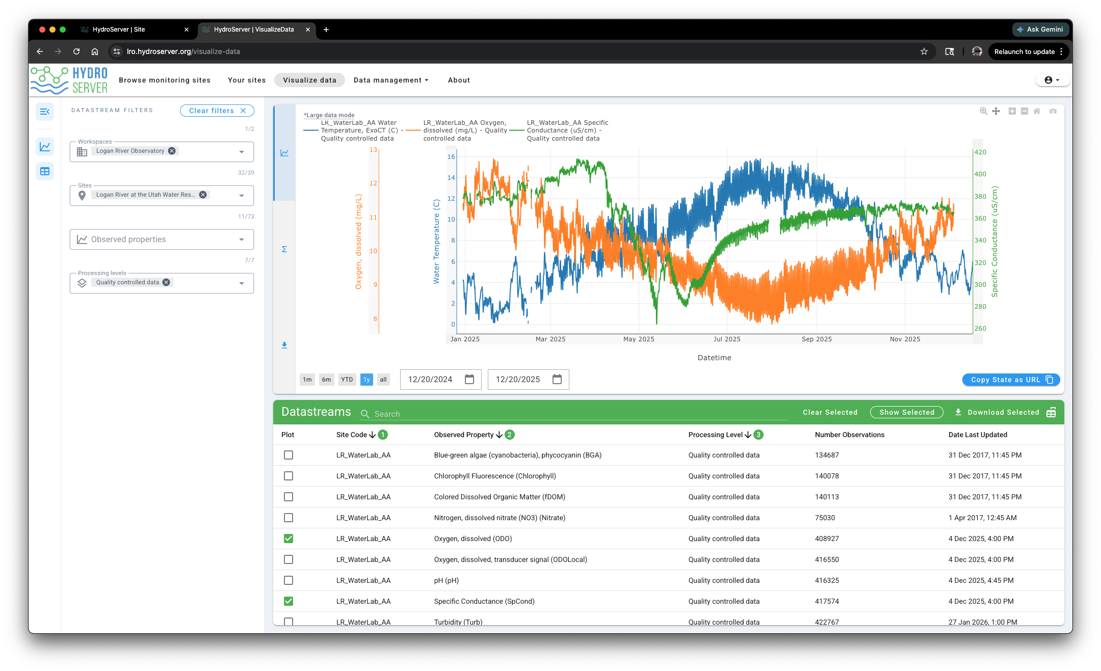
Data Visualization Page
The HydroServer data visualization page is intended to provide dynamic and screening level visualizations of data for monitoring data quality and integrity, exploring relationships, and previewing data prior to download. You can access the 'Visualize data' page by clicking on the link in the main navigation at the top of the page.
On the left you will see datastream filters that you can use to narrow the list of datastreams in the selection list at the bottom of the page.
To select time series for visualization, click the check box next to them in the list of datastreams at the bottom of the page. You can select up to 5 datastreams at once for visualization. The selected time series will be plotted, each with a separate y-axis
Visualization Controls
The following visualization controls help control the data visualization page:
- Navigation Rail - the navigation rail at the very left of the page has three buttons that allow you to collapse the filters panel, the plot window, and the datastreams table. This helps you maximize the space available for the plot
- Datastream Filters - the filters control which datastreams are shown in the table at the bottom making it easier to find datastreams for plotting.
- Date controls - At the bottom left of the plot are date controls that enable simple selection of the date range shown in the plot.
- Plot zooming tools - At the top right of the plot window there are dynamic zooming tools that enable zooming in and out on the plot.
- Scrollable and zoomable y-axes - Each of the y-axes can be scrolled by clicking on them and dragging or by hovering over them and using the mouse wheel to zoom.
- Legend - A legend is shown at the top left of the plot to identify datastreams in the plot.
- Copy state as URL - This button copies the state of the window as a URL that can be used to open the window in a particular state for sharing visualizations.
- Datastream metadata view - Clicking on a datastream row in the list at the bottom of the page pops up a view of the full datastream metadata along with a button to download the datastream.