Quality Controlling Data with the QC App
WARNING
The HydroServer Quality Control (QC) App is currently under active development. We hope to make a first public release during the summer of 2026. The user documentation provided here is intended to be a description of what the QC App can do. Some of this functionality is still under construction and may not work correctly yet. A demo of the QC App is available for the HydroServer Playground instance at https://playground.hydroserver.org/quality-control-demo/. If you want to try it out, you should create a workspace on the Playground instance, load some data, and then select that workspace with the QC App. We update the Playground instance periodically with the latest functionality, but the version deployed there might not match the latest functionality under development.
This guide is for the operator of the QC App: Usually a hydrologist or data technician who picks a datastream, flags, edits, and/or corrects the bad or erroneous points, and then submits the cleaned datastream back to HydroServer. It walks through every feature of the QC App and the shortest path to common QC tasks.
If you are looking for developer / deployment docs for the QC App, start with the QC App ARCHITECTURE documentation instead.
What this app does
The QC App is the operator's view of HydroServer's quality control pipeline. With it you can:
- Browse monitoring sites and datastreams in a HydroServer workspace.
- Plot up to five datastreams on a synchronized multi-axis chart for visual context.
- Pick one datastream as the QC target. The rest are read-only reference traces.
- Filter suspicious points using value thresholds, time windows, change detection, rate-of-change limits, gap detection, or persistence runs.
- Edit the selected points: change values, interpolate, drift-correct, shift datetimes, delete, fill gaps, add points, attach qualifier flags.
- Save your edits as a QC history (a JSON file you can replay on the same datastream later).
- Submit the cleaned observations back to HydroServer to save them.
Everything runs in your web browser. The backend never sees your edit history until you press Save.
Glossary
| Term | Meaning |
|---|---|
| Workspace | A HydroServer scope (one organization or project's data). You pick one when you sign in to the QC App. |
| Thing / Site | A physical monitoring site or sampling location. |
| Datastream | A single time-series at a site: one variable, one sensor, one processing level. |
| Observation | A single (timestamp, value) measurement. |
| QC target | The datastream you are editing. There is always exactly one QC target when the Edit view is open. |
| Context traces | The other plotted datastreams. Visible but read-only. They exist to give you context for the QC target. |
| History | The ordered list of filters + selections + edits you've applied in the current edit session. Undo / redo / save / load all operate on this list. |
| Selection | The set of point indices a filter (or your click / lasso) produced. Edits operate on the current selection. |
| QC history | A JSON file holding your editing history for a datastream. This is the canonical save format. |
| Submit / Save | POST the cleaned observations back to HydroServer to either overwrite the existing observations in the window you have plotted or to be saved as a new datastream, depending on your versioning scheme. |
First-time setup
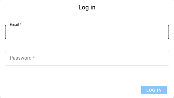
Open the app URL. You'll be redirected to the Log in page.
Enter your HydroServer email and password, then press Log in. If your deployment has Google OAuth wired up an extra "Sign in with Google" button appears below the form.
WARNING
Log-in is currently disabled in the QC App. If you want to try the demo deployment, make sure your Workspace and its contents are publicly visible.
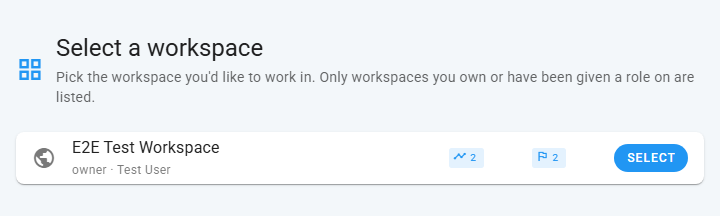
On the Workspaces page, pick the workspace you want to work in. The choice is remembered locally, so next time you sign in you'll land directly on Home.
On Home, the left filter drawer is open. Pick a time range and filter the datastream list by site / observed property / processing level. Click a row to plot it.
If the screen ever stays blank with a console error like Failed to fetch app settings, ask your administrator to check the API URL and COOP/COEP configuration (the QC App DEPLOYMENT documentation covers this).
The QC App user interface, top to bottom
The two main views in the QC App are Select (browse + preview) and Edit (the QC workbench). The narrow icon column on the far left (the navigation rail) switches between them.
Navigation rail
A thin, always-visible column of icons.
| Icon | Action |
|---|---|
| HydroServer logo | Top left. Go home. Resets the current view. Prompts before discarding unsaved edits. |
| Cursor (Select) | Top left. Show the datastream Select drawer + plot. |
| Pencil (Edit) | Top left. Open the Edit view. Disabled until you've picked a QC datastream for editing; the tooltip explains why. |
| Stopwatch (Performance) | Bottom left. Open the Performance Calibration dialog. See "Performance" below. |
| Grid (Workspace) | Bottom left. Switch workspace. |
| Logout | Bottom left. Sign out. |
If you click any of these while you have unsaved edits in the Edit view, the app shows an "Unsaved edits" dialog with Save & continue / Discard / Cancel. Discarded edits cannot be recovered.
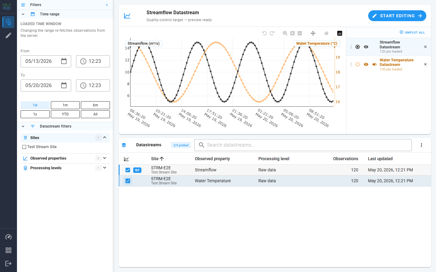
Select view
The select view is the default landing surface after picking a workspace. The left filter drawer is collapsible via the chevron icon at its top, and it is resizable by dragging its right edge.
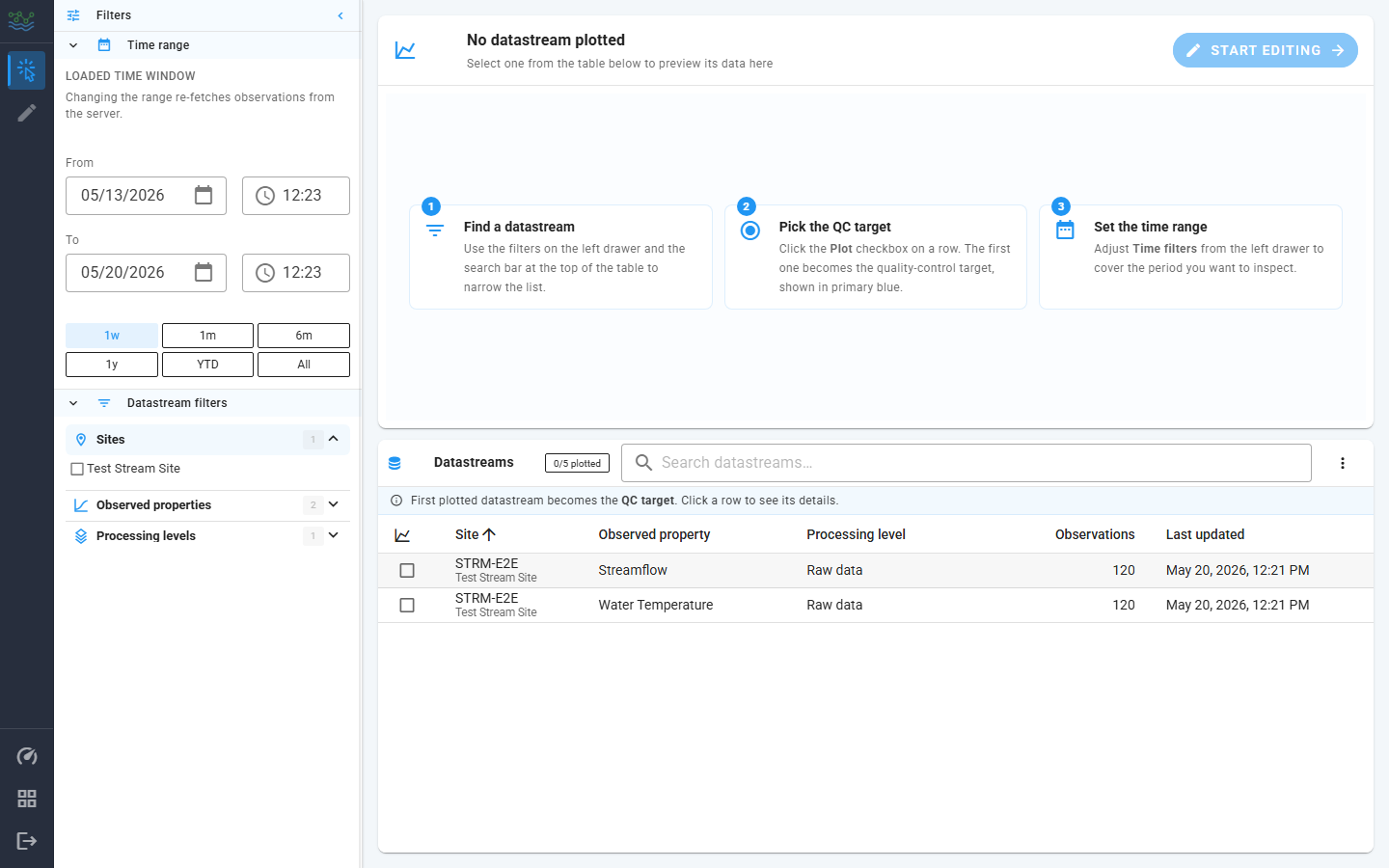
The filter drawer has two collapsible sections:
Time range: the loaded time window for the selected datastreams. The two date pickers (
From/To) are the source of truth. They will respond when you make a selection in the row of preset chips below them: 1w, 1m, 6m, 1y, YTD, All. Picking a preset re-fetches observations from the server. ACustomchip appears when the dates were edited manually in theFromandTodata pickers.Tip: when previewing a brand-new datastream whose observations might be years old, click All first. The default
1wpreset can show an empty window for old data and make the plot look broken.Datastream filters: These filters allow you control the list of datastreams shown in the datastreams table by picking the site, observed property, and/or processing level. The list of matching datastreams updates live in the datastreams table.
The main area to the right of the window is split top/bottom:
- Top card carries the preview plot, the current QC target's name (or "No datastream plotted"), and the Start editing button that jumps to the Edit view. The right pane of the card lists currently plotted datastreams.
- Bottom card is the Datastreams selection table: listing every datastream the filters match. Each row is a datastream and has a plot toggle (check box); the first datastream you toggle on becomes the QC target (radio button column in the Plotted Datastreams List).
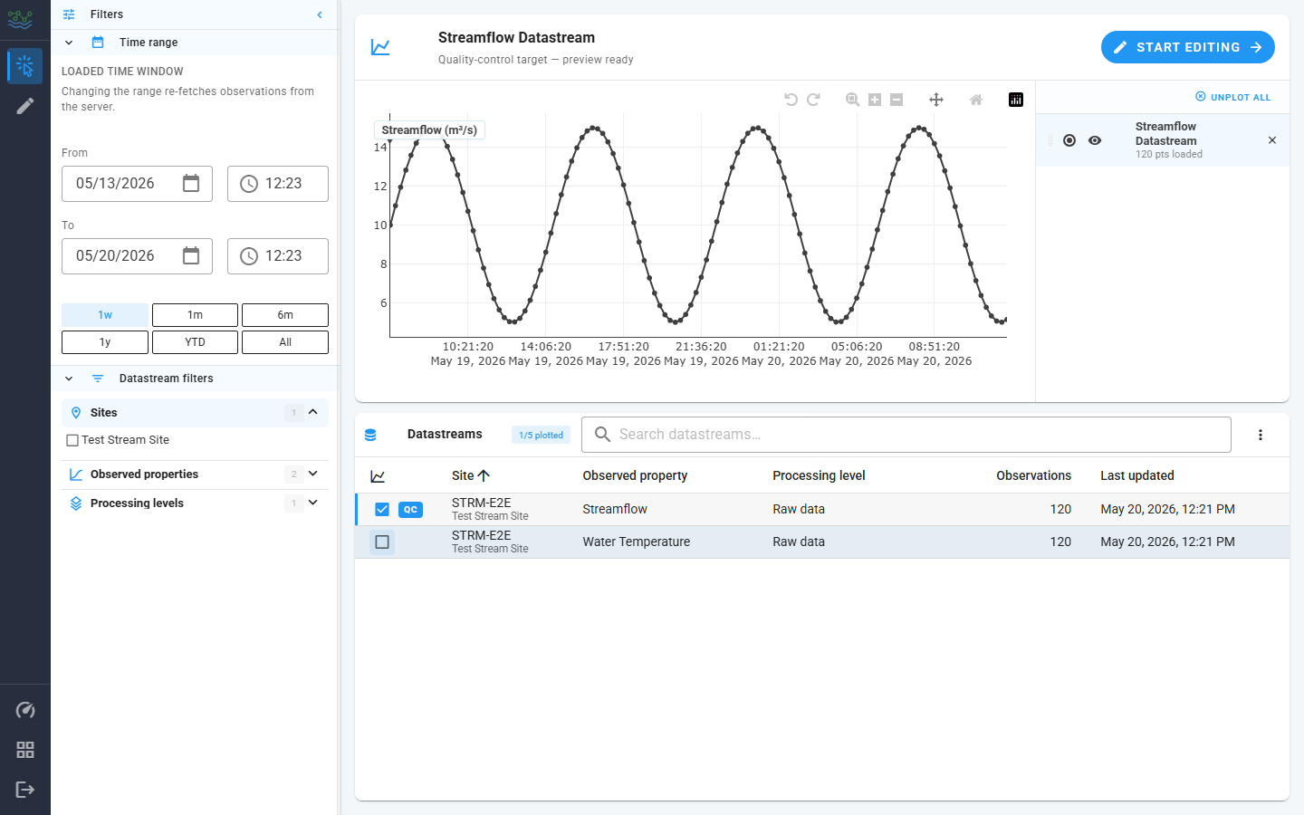
Clicking a datastream row shows the full metadata for a datastream. Clicking the plot toggle (check box) in the row plots the datastream. The first datastream selected for plotting becomes the QC target. You can change the QC target via the radio button column in the Plotted Datastreams list.
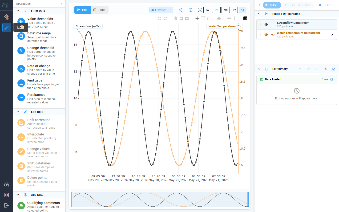
Edit view
The Edit View opens when you click the pencil icon in the left hand navigation rail, or when you click the Start editing button on the Select view. The Edit View is available only after you've picked a QC datastream.
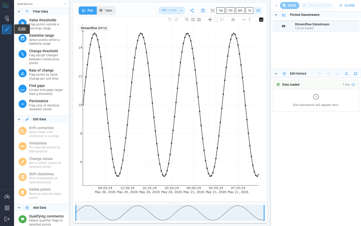
The Edit View consists of three columns, each independently resizable / collapsible:
| Column | Contents |
|---|---|
| Left ("Operations") | The Edit drawer with three sections: Filter Data, Edit Data, Add Data. |
| Center | The Plotly chart + a tab-switched data table (upper left) for the QC target. |
| Right ("Aux") | At the top: Save / Save & Close / Close actions. Below that: the list of Plotted Datastreams, Edit history, and the currently staged Operation Panel. |
The chart at the top of the center column has a Plotly toolbar with:
- Undo zoom / Redo zoom: step backward and forward through the current session's zoom-and-pan history.
- Zoom (drag a horizontal box on the x-axis), plus Zoom in and Zoom out buttons that step the X scale around its center.
- Pan (hold + drag).
- Box select / Lasso select: the primary way to select points for an edit.
- Reset axes: Reset zoom back to the full plotted window.
- Fit X to visible / Fit Y to visible: rescales the corresponding axis to the data currently inside the viewport.
See the Pan and zoom across axes section below for the gestures these buttons map to and the per-axis tricks that aren't represented as toolbar icons.
Hover any toolbar icon to see its name. The left side of the toolbar flips between Plot and Table views (see below); the right side carries the data points toggle, a share-link button, and the ? help menu.
Between the help menu and the right edge is a drop down box with pre-selected zoom levels (All Data, Last Week of Data, Last Month of Data, Last 6 months of data, Last Year of Data). Clicking one of these options zooms the X axis to that window, without refetching observations, unlike the sidebar's identical-looking chips on the Select view. The active chip stays highlighted as a reminder of the last preset applied; clicking it again re-applies it, which is the easiest way to "snap back" after a manual pan or wheel-zoom.
Clicking a single point on the plot selects just that point. Clicking the empty plot area clears the selection.
Plot vs Table tabs
The segmented control at the top-left of the plot toolbar (Plot / Table) switches the center column between the Plotly chart and an editable observation table. Both tabs operate on the same QC datastream and share the selection state; flipping between them preserves edits, history, and the currently selected points.
The Table tab opens a virtualized list of the QC target's observations:
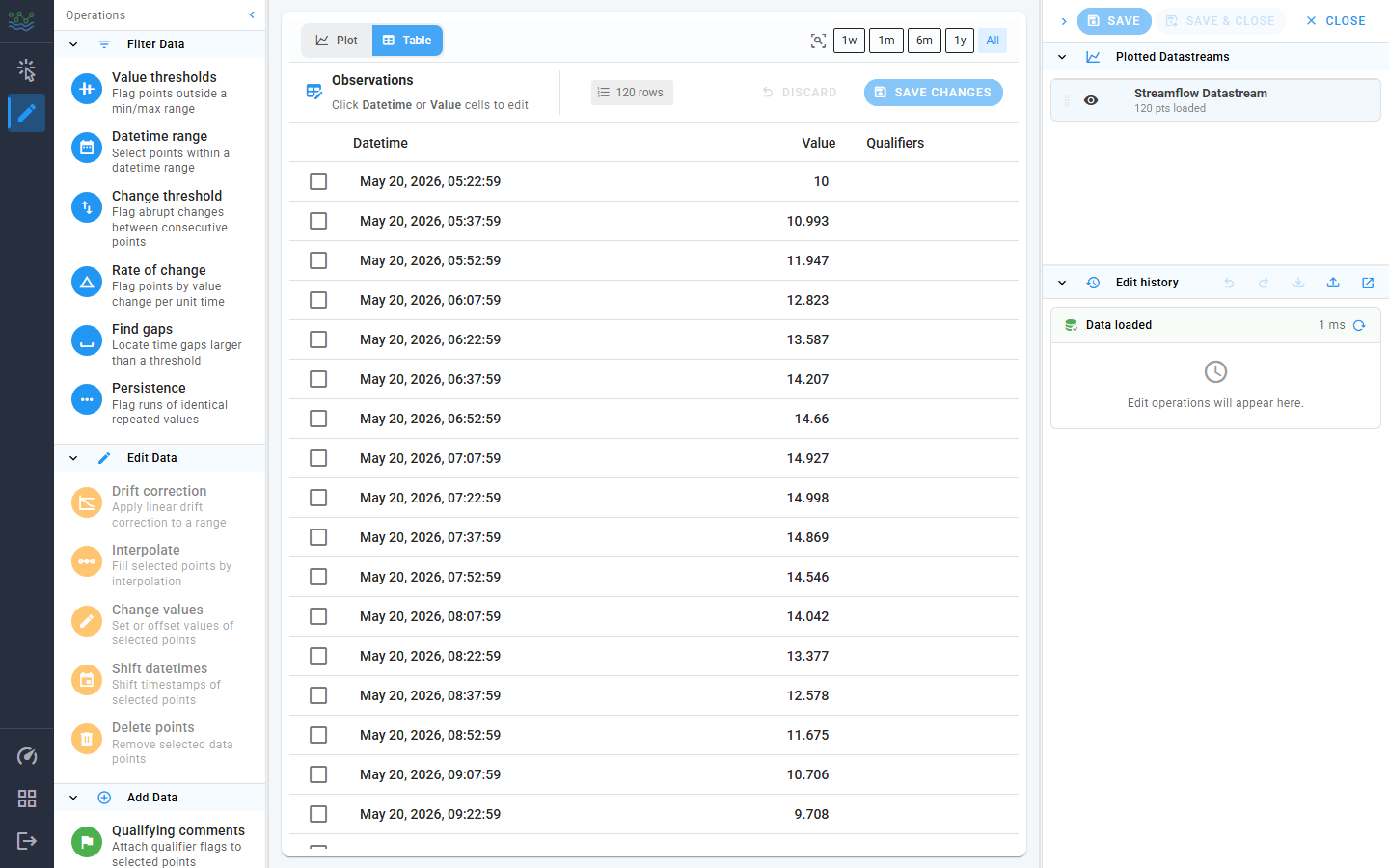
What you can do here:
- Edit values inline. Click a
Valuecell to enter edit mode, type a new number, press Enter (or click outside) to commit. The cell shows a chip indicating the prior value so a typo is easy to spot. - Edit timestamps inline. Click a
Datetimecell to open adatetime-localpicker; the same edit-then-commit flow applies. - Bulk-select for an operation. The leading checkbox column toggles a row in or out of the selection. Selected rows match the selection on the plot, so you can stage a Delete points / Change values / Interpolate edit from the table just as you would from a box-select on the chart.
- Track pending edits. The toolbar chip
N unsavedlights up whenever the table has uncommitted edits. Discard rolls every pending edit back; Save changes flushes them through the same history machinery as a Change-values or Shift-datetimes operation (one history entry per cell type). - Inspect qualifiers. The
Qualifierscolumn shows the qualifier codes attached to each observation (set via the Qualifying comments panel). Hover a chip for its description.
The table is the fastest path for a small number of targeted edits. For anything wider (a hundred points, a window of bad values, a drift correction) the plot's box-select gestures + Edit drawer are faster.
Data points toggle
The chart-timeline icon at the top-right of the plot toolbar controls whether individual point markers are drawn on top of the plotted line(s). Lines stay visible either way; only the marker dots are gated. Turning markers off is the fastest way to make a busy plot readable, or to recover responsiveness when scrolling around a dense series.
Click the caret (drop down) next to the icon to open the mode menu:
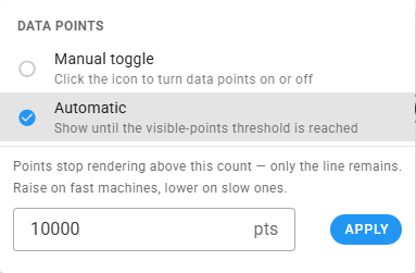
Two modes are available:
- Manual toggle: the icon doubles as an on/off button. Click it to flip markers on or off. The icon's appearance reflects the current state.
- Automatic (default): markers render until the count of visible points exceeds a threshold (default
10,000), then drop out so the chart drawing stays smooth. In this mode, the icon is replaced by a live counter showingvisible / thresholdso you can see how close you are to the cutoff. Hover over the counter for the exact numbers.
The threshold input below the mode list edits the cutoff used in Automatic mode. Raise it on fast machines if you want markers on even denser views; lower it on slow machines to drop markers sooner. The new value applies on Apply (or on Enter).
The setting is persisted locally, so it survives reloads.
Share link
The address bar is always a shareable representation of the current plot. Click the share icon in the plot toolbar to copy the URL to the clipboard; you can also just copy the URL from the bar manually.
The URL encodes everything needed to reproduce what the sender is looking at - query parameters are shown in parentheses:
- Workspace (
ws) - View (Select vs Edit;
m=efor Edit) - Active center-column tab (
tab=tfor Table) - Plotted datastreams (
ds), in order. The first id is the QC target. - Time window: either a preset id (
r=0..5) which the recipient re-anchors to their "now", or an explicitfrom/topair as base36 second-epochs when the sender used a custom range. - Per-trace eye-toggle visibility (
h) and per-axis visibility (ya) as hex bitmasks over thedsorder. - Plot zoom: X zoom (
z) plus optional per-Y-axis zoom (yz) for axes that aren't at their default fit. - Data points mode (
dp) and threshold (th) when they differ from the app defaults.
Defaults are elided to keep URLs short. Sidebar filters (things / observed properties / processing levels) are kept in the URL only on the Select view, because they drive the datastreams table rather than the plot.
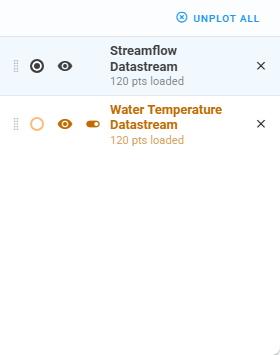
Plotted datastreams list
The right-hand list (visible on both Select and Edit views) is the roster of currently plotted datastreams. Each row carries:
- A drag handle to reorder the list (drag the QC target's row to promote / demote it; the line colors track the order).
- A colored radio dot that picks the QC target. The active row is tinted; the other rows render in their reference color.
- An eye toggle that hides the trace from the plot without unplotting it. Hidden rows render with a strikethrough.
- A Y-axis toggle (non-QC rows only) that collapses that datastream's secondary axis to provide more horizontal space for the plot.
- The datastream name and a subtitle showing the number of points loaded in the current time window, e.g.
1,248 pts loaded. While the fetch is still in flight, the subtitle readsloading….- An
×button to unplot the row.
- An
If a plotted datastream has no observations in the current window (either because the dataset is empty there or because the chosen time range doesn't cover its data), the row title shows a small warning-tinted database icon. Hover it for the tooltip "No observations in the current time window". Widening the time range (or clicking All in the Time range section) usually clears it.
Plotting multiple datastreams
You can plot up to 5 datastreams at a time. The plotted count and cap are surfaced in the Datastreams table toolbar as a chip ("N/5 plotted"). Once you hit the cap, the unchecked rows disable their plot toggles and a tooltip explains why. Unplot a row from either the table or the list to free up a slot.
When more than one datastream is on the plot:
- The first datastream you plot becomes the QC target and uses the primary (left) Y axis. Its line draws in black with a point marker on every observation.
- Each additional datastream gets its own Y axis on the right side of the plot. The chip at the top of each axis carries the datastream's display name plus its unit (e.g.
Water Temperature (°C)). Up to four secondary axes stack side by side. - Axis chips are colored to match their line so you can tell at a glance which trace goes with which axis.
Once a datastream is on the plot, the plotted datastreams list on the right is where you manage it (see the previous section for the row anatomy). The interactions most relevant to multi-series work:
- QC target picker: clicking the colored radio dot on a non-QC row promotes that datastream to the QC target. The primary Y axis rebinds to its scale and the previous QC datastream demotes to a secondary axis. The Edit view shows only the QC target's points for selection. Context traces are read-only.
- Eye toggle: hide / show a trace on the plot without unplotting it. Useful when one series is visually crowding the others. Hidden rows render with a strikethrough; their axis stays on the plot so the scale doesn't jump.
- Y-axis toggle (non-QC rows only): collapse just the secondary axis without removing the trace. Reach for it when the extra axes start eating horizontal room and you don't actually need the numeric scale.
- Drag handle: drag a row up or down to reorder the legend. The plot redraws so the trace colors track the new order.
- × button: unplot the row entirely. Removing the QC target promotes the next plotted row to QC.
Pan and zoom across axes
The Plotly toolbar at the top of the chart drives the X-axis gestures (Zoom, Pan, Reset). For Y axes, the gestures are slightly different and worth knowing about when you're juggling several datastreams:
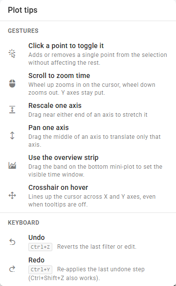
- X-axis zoom: drag a horizontal box on the time grid (Zoom tool), or scroll over the plot. Every axis stays time-synchronized.
- X-axis pan: enable Pan in the toolbar, then drag the plot body. The context plot at the bottom is also draggable. It acts as an overview thumbnail.
- Per-axis zoom: hover near the ends of any axis and drag. Only that axis rescales. Sibling axes keep their current view. This is how you "compare units": drop the temperature axis to a tight window without touching streamflow.
- Per-axis pan: hover the middle of an axis and drag.
- Reset: the home icon on the Plotly toolbar returns to the default zoom (does not change the begin/end dates in the sidebar).
- Fit Y/X to visible: the collapse icons in the toolbar rescale the X or Y axis to the currently visible points. Handy after a deep zoom when one trace ends up off-axis.
- Undo zoom / Redo zoom: the curved-arrow icons at the far left of the modebar step backward and forward through the zoom-and-pan history of the current session. Each settled gesture (wheel scroll, box-zoom, pan drag, preset chip, or a hydrated URL zoom) becomes a new entry. These are independent from the Edit-history Undo / Redo (
Ctrl+Z/Ctrl+Y), which operates on filter and edit operations. Zooming the chart never adds anything to the edit history, and undoing an edit never moves the camera.
The ? (help) menu in the plot toolbar carries a "Plot tips" card listing the hidden gestures (per-axis pan/zoom, scroll-to-zoom, crosshair, overview strip) and the keyboard shortcuts (Ctrl+Z undo, Ctrl+Y redo). Toolbar icons aren't listed there because each one already shows its name on hover.
Edit drawer (left)
The Edit drawer is a vertical column of operation rows, grouped into three collapsible sections that share the same chevron + tinted-header treatment as the Select drawer.
| Group | Tint | Purpose |
|---|---|---|
| Filter Data | Blue | Select points without changing values. The result is a selection on the plot. |
| Edit Data | Blue (or amber for "needs selection") | Change values or timestamps on the current selection. Amber rows disable themselves until you make a selection. |
| Add Data | Green | Insert new points (Add Points, Fill Gaps) or attach data qualifiers without changing values. |
Click a row to open its panel on the right; click the same row again to dismiss it.
The QC operations, panel by panel
Every panel opens in the right column with the same header layout: an icon-colored avatar, the title and one-line description, and an × button to close. All panels list the current selection size at the top (when relevant). All commit buttons live in the panel footer.
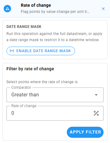
Date range mask
Every filter panel (except Datetime range, which already owns its own picker) opens with a collapsed Date range mask section at the top. By default the filter scans the full datastream. Click Enable date range mask to constrain it to a datetime window.
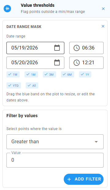
When enabled, the section exposes:
- Two date/time pickers (
From/To); these are the source of truth. - Preset chips (1W, 1M, 3M, 6M, 1Y, YTD, All) that snap the pickers to a common window relative to the loaded data.
- A draggable blue band overlaid on the plot. Resize it by dragging either edge, or move it whole by dragging its middle. The pickers and the band stay in sync.
Run the filter as usual (value thresholds, change threshold, rate of change, find gaps, persistence) and only points inside the window are considered. Filters whose result is a selection (Find gaps, Datetime range) honor the mask too. The × icon in the section header disables the mask and reverts to "full datastream" scanning. Closing the operation panel also clears the mask.
Use the mask when you want to QC a specific event window without touching the rest of the series: e.g. flag persistence runs only inside a known outage, or apply a value threshold only to last month's data.
Filter operations
These do not change data. They produce a selection that the next edit operation acts on.
Value thresholds
Flag any point whose value satisfies a chosen comparator (>=, >, ==, <, <=). You can combine multiple comparators. Each appears as a removable chip under "Applied".
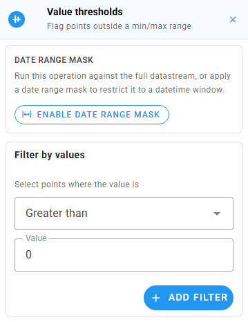
Typing a number and pressing Enter (or clicking Add filter) runs the filter. The selection on the plot updates live. Use Clear all on the applied chips row to remove every comparator at once.
Example: "Anything reading > 100 mg/L is bad" → set
Greater than: 100and run. Every offending point is now selected.
Datetime range
Select every point inside a datetime window. The panel uses the shared range stager: two date/time pickers, a row of presets, and a draggable band overlaid on the plot.
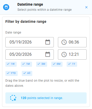
The selection updates live as you drag the band or edit the dates. There's no commit button. The alert at the bottom shows the running count of points caught.
Change threshold
Flag pairs of adjacent points whose value delta satisfies a chosen comparator. Catches sudden spikes / drops that violate physical plausibility.
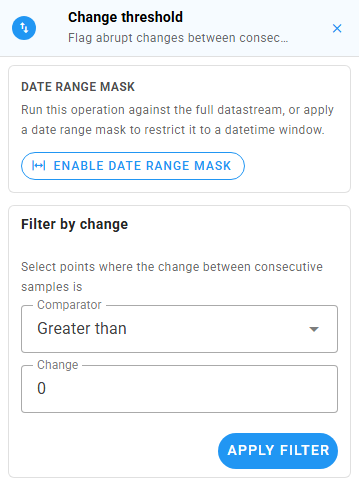
Pick a comparator from the dropdown, type the delta, and click Apply filter (or press Enter on the value field).
Rate of change
Like Change, but normalized to value change per unit time and expressed as a percent. A >= 50 % threshold flags points whose fractional change is at least one half of their neighbor's value.
Find gaps
Locate gaps in time between consecutive observations that exceed a threshold. The panel uses the shared gap finder: a date-range stager, threshold with units, snap chips (when the datastream declares an intended cadence), and red bands overlaid on the plot. The endpoints of every detected gap are selected on the plot. There's no commit button.
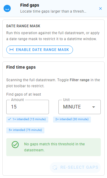
The Re-select gaps button at the bottom re-applies the current gap endpoints to the plot. Useful when a box-select or lasso has wiped the visible selection.
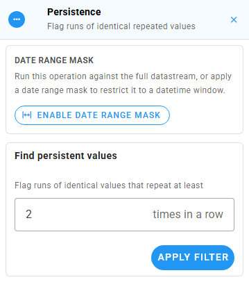
Persistence
Flag runs of identical repeated values (e.g., the sensor got stuck on the same reading for 30 minutes). Set the minimum run length with the "times in a row" stepper and click Apply filter.
Edit operations
These change values or timestamps at the current selection. The drawer disables them (amber row) until you make a selection. The panel shows an "empty state" with a hint if you open it with no selection active.
Drift correction
Apply a linear drift correction across each consecutive group in the selection. Use this when a sensor has drifted from a known reference.
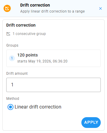
The panel lists every consecutive group it found in your selection, each with its first-point timestamp. Drift amount is the offset to apply linearly from the start to the end of each group. The radio at the bottom selects the method (today the only option is "Linear drift correction"). Drift correction needs two or more consecutive points; the Apply button stays disabled until that's true.
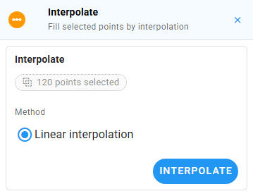
Interpolate
Replace each consecutive group in the selection with linearly interpolated values from the surrounding good points.
Change values
Apply an arithmetic operator at each selected index. The toggle row is + − × ÷ =. The label below the toggle reminds you of the operation: New value = old <op> input.
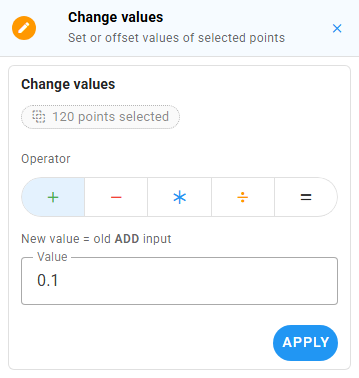
Press Enter on the value field, or click Apply, to commit.
Shift datetimes
Offset the selection's timestamps by a duration. Pick an amount and a unit. Useful when a sensor's clock was off and the recorded datetime values need to be shifted by a known offset.
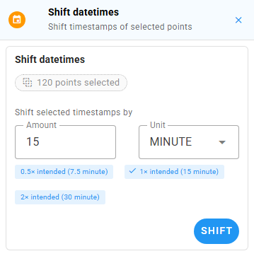
When the QC datastream declares an intendedTimeSpacing, the panel shows snap chips (0.5×, 1×, 2×) that pre-fill the amount with a multiple of the intended cadence. The active chip gets a check mark.
Delete points
Drop the selected points from the series entirely. The warning banner repeats the count of points about to disappear. The destructive red Delete button is the only commit affordance.
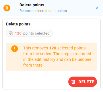
The deletion is recorded in history and can be undone from there.
Add operations
Qualifying comments
Attach qualifier flags (e.g., "Ice affected", "Estimated") to the selected points. Pick one or more qualifiers from the autocomplete. Existing qualifiers already applied to the selection are listed below in chip form.
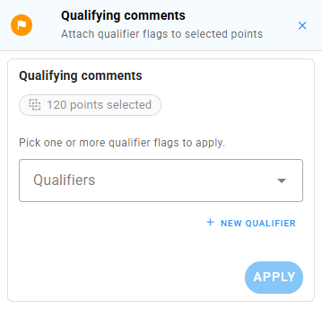
The New qualifier button opens a small dialog where you can register a new data qualifier code + description against the workspace.
Note: qualifier codes are tracked locally in your browser and are POSTed to the workspace's qualifier list, but the per-point qualifier applications themselves are not yet serialized to the backend on Save. See the QC App QUALITY documentation for the status.
Add points
Insert one or more (datetime, value) tuples. Each row is a card with a datetime picker and a value field. + Row appends another row, the × icon removes one.
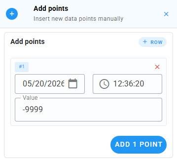
The first row is seeded with the last selected point's timestamp (or the last observation in the series) plus the datastream's intended cadence, so a quick "extend the series by one point" workflow is one click + one number. Subsequent rows auto-increment by the same cadence.
Fill gaps
Detect gaps over a threshold and fill them with interpolated values or a constant NoData value at a chosen cadence.
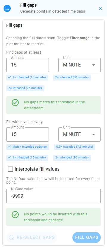
The panel reuses the Find-gaps finder at the top (date range, threshold, snap chips, plot-overlay bands), then adds:
- Fill with a value every <amount> <unit>: the insertion cadence. A Match intended cadence chip is shown when the datastream declares one;
0.5×,1×,2×snap chips fine-tune from there. - Interpolate fill values checkbox: when on, inserted values are linearly interpolated between the gap endpoints. When off, the panel reveals a NoData value field that's used for every inserted point.
- A live status row at the bottom reports how many gaps were found and how many points the current cadence would insert.
- Ghost-marker preview points on the plot for every planned insertion.
Cadence warnings appear when the fill step would skip gaps just above the threshold, or when the cadence doesn't divide evenly into the datastream's intended spacing. The Re-select gaps button mirrors the one in Find gaps.
Workflow: if you only want to see the gaps without filling them, use Find gaps instead. Fill gaps is the same finder with the fill controls bolted on.
The Edit history panel
Every filter, edit, and add operation appends a row to Edit history in the right sidebar.
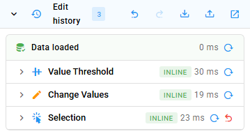
The header carries the count chip and four icon buttons (left to right): undo, redo, save QC script (tray-arrow-down), load QC script (tray-arrow-up), and open in window (the pop-out icon, which reopens the same panel inside a modal). Keyboard shortcuts: Ctrl+Z to undo, Ctrl+Y or Ctrl+Shift+Z to redo.
The body shows:
- A baseline Data loaded row at the top, with a reload-from-server button.
- One row per history entry, each with:
- The operation icon and Title-Case name.
- A failure badge (red
!) if the op threw at author time. Common after a script import that references something missing in this datastream. - A duration badge.
- In dev mode, a small chip showing whether the op ran inline or on a worker.
- A reload-from-this-step button that replays history up to but not including this entry.
- An undo button on the trailing entry only (older entries are undone via Reload-from-this-step).
- A chevron toggles an inline "Arguments" drawer that shows the raw qc-utils call arguments.
Clicking the chevron at the very top of the panel collapses the whole panel; the pop-out icon opens the same panel inside a wider modal so you can scan a long history without losing the rest of the sidebar.
Save / load a QC history
The QC history is the canonical save format. It's a JSON file you can keep, re-apply, share, or version-control.
Save
In the Edit history header, click the tray-arrow-down icon ("Save QC history"). The browser downloads a file named like:
qc-script-<datastream-name>-<isoTimestamp>.jsonThe file contains:
- The wall-clock window of the plotted data.
- Every operation in the history, in order, with its args.
A Snackbar confirms "QC history saved."
Load
Click the tray-arrow-up icon ("Load QC script") and pick a JSON file. The app will:
- Fetch the QC history's authored window into your current QC datastream (the indices in selection-coupled ops reference the windowed dataset, so the window has to match).
- Replay each operation in order.
- Show a Snackbar with
Loaded N operations, plus a warning if any ops failed.
Per-op failures do not abort the replay. The app keeps going. If your script targets columns that don't exist in the new datastream (e.g., a qualifier code that isn't registered), that specific op fails and shows a red ! badge on its history row, but the rest still run.
When to use it
- Repeatable QC. Apply the same QC routine to your raw dataset to generate the quality controlled dataset.
- Audit trail. Save the QC History script before submitting, so you have a record of every transformation you applied.
- Iterate offline. Edit the QC History script's JSON if you want to tweak a threshold without re-clicking through the panels.
Submit (Save / Save & Close)
When you're satisfied with the edits, hit one of the action buttons at the top of the right sidebar:
- Save: uploads and keeps you in the Edit view.
- Save & Close: uploads, clears history, and drops you back to the Select view.
- Close: abandons the session. If you have unsaved edits, the Unsaved-edits dialog intercepts you.
Clicking Save (or Save & Close) opens a confirmation dialog so a misclick won't push data to the server.
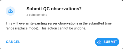
Once you confirm:
- The app POSTs the cleaned observations to HydroServer, which either overwrites the existing observations in the plotted window or saves the cleaned observations to a different datastream, depending on your data versioning scheme.
- On success, the Snackbar shows "Quality-controlled observations submitted" and the local history is cleared.
- On failure, the Snackbar shows the backend's error message verbatim. Show that to your administrator if you need help.
Performance and big datastreams
For datastreams with hundreds of thousands of points:
- The first All-range fetch takes a while (paginated at 50,000 obs per page). The Snackbar shows a per-stream loading indicator.
- Long-running operations run on web workers when available, so the UI stays responsive. If your browser doesn't support
SharedArrayBuffer(or the deployment dropped the COOP/COEP headers), operations run inline and a particularly large edit may freeze the UI for a moment. The result is identical either way. - The Performance Calibration dialog (stopwatch icon in the nav rail) shows the measured worker / inline throughput on your device and lets you re-benchmark on demand. If big edits feel slower than they used to (e.g., after you upgraded your OS), re-benchmark.
See the QC App PERFORMANCE documentation for the envelope details.
Common tasks
"I just want to drop everything above 1000 and re-submit."
- Pick a workspace, then pick the datastream you want to QC.
- Plot it (it becomes the QC target).
- Click All in the Time range so you load the full series.
- Click the pencil icon → expand Value thresholds, set
Greater than: 1000, press Enter. - Expand Delete points, click Delete.
- Click Save (or Save & Close), then confirm in the dialog.
"I want to drift-correct a known-bad interval."
- Plot the datastream. Zoom in to the bad interval on the chart.
- Drag a box select around the interval. You need at least two consecutive points.
- Open the Edit drawer → Drift correction → set the drift amount (the offset to apply linearly from start to end of the selection) → click Apply.
- Inspect the result on the chart. Use the undo button in Edit history if it's wrong.
- Click Save when satisfied.
"I want to replay last week's QC on this week's data."
- Load the new week of data on the same datastream.
- Open the Edit history header → click the tray-arrow-up icon → pick last week's JSON.
- The script's authored window may differ from this week's; the app will fetch the script's window. To re-apply against the new window instead, save the new window first, edit the script's
windowfield in a text editor, then re-import. - Review the history. Click Save.
"I picked the wrong workspace."
Click the grid icon in the nav rail → pick another. If you have unsaved edits, the app asks first.
Troubleshooting
| Symptom | Likely cause | Fix |
|---|---|---|
| Blank page on load | Wrong API URL or localhost vs 127.0.0.1 mismatch. | See the QC App DEPLOYMENT documentation. |
| Plot stays empty after picking a datastream | Time range falls outside the datastream's observations. The plotted row shows a database-off icon and the subtitle reads 0 pts loaded. | Click All in Time range. |
| Pencil ("Edit") icon is greyed out | No QC datastream selected. | Plot at least one datastream. The first becomes the QC target. |
| Big edits freeze the page | SharedArrayBuffer not available; running inline. | Have your admin re-enable COOP/COEP headers, or accept the slower fallback. |
| Save fails with a backend error | Permissions / workspace issue / network. | The Snackbar shows the backend message verbatim. Share that with your admin. |
| The history shows a red failed entry after Load | The script referenced something missing in this datastream. | The rest of the script still ran. Click the chevron on the row to see its arguments. |
See also
- HydroServer QC App GitHub repository
- QC App ARCHITECTURE: what's running behind the screen